Tasteworks

Selected projects we have worked on in the food & drinks sector since 2010.

Art Direction / Branding / Packaging / Website / SEO

Developing a unique brand that reflects the restaurant’s personality and theme. We made the identity feel less synthetic and focussed more on the fun, simple and confident approach.

MakHalal was founded in 2016 in Small Heath, Birmingham. Their vision was to create something that celebrated the concept of Halal and wanted to build an environment where food lovers could socialise, share their mutual appreciation for burgers and have a great time.

We created a cohesive visual identity, including elements such as packaging, advertising, menu design, signage and uniforms. This will help to create a consistent look and feel for the restaurant. We developed a brand voice and messaging strategy looking at taglines/slogans that capture the essence of the restaurant, as well as crafting social media posts that reflect the brand’s personality.

Branding

Passion, poetry and of course the love of food, run deep in the veins of Kashmir, Punjab and the North West Frontier. We created a fresh new brand identity for West Yorkshire based Shimlas.

Shimlas are West Yorkshire’s first, traditional Punjabi style restaurants with six other locations in the midlands. They combine the finest meats, the freshest vegetables, and the richest spices into our traditional Pakistani/Punjabi dishes which burst with flavour, dazzle with colour, and delight the senses. Their mouth-watering menu is full of sensationally spicy classics that have been refined through the generations, as well as plenty of creative, contemporary and locally inspired dishes infused with inventive twists and modern flair.

We were commissioned to give their brand more of an identity with exploring ways of how their logo can be applied to their marketing materials. We refined their logo as well as applying traditional Urdu wording across their identity. As well as their logo creation we created a range of patterns that would be used across their website and social media platforms to give the Shimlas brand a fresh pop of colour.

3D Visualisation

Creating 3D visualisations of limited edition single malt scotch whisky bottle for Eden Mill’s Art of St. Andrews Collection. The bottle is a realistic model, with high-quality textures and materials. The lighting is dramatic and creates a sense of depth. The background is simple but effective, and helps to draw attention to the bottle.

This beautiful limited edition presentation whisky box, adored with the work of this year’s collaborating artist Mairi Clark.

For 2022, Mairi Clark has created a richly textured and vividly colourful oil painting of the dramatic St Andrews coast — incorporating a subtle depiction of our upcoming whisky distillery, as a bright point on the horizon ahead. Mairi’s artwork perfectly echoes the marriage of flavours in this year’s limited edition St Andrews whisky expression: which is a sweet yet subtly spicy whisky, that brings a rush of sherry and apple notes underpinned by a toasty, buttery nuttiness and zesty bitters.

Art Direction / Branding / Website / SEO

Brand identity and website for this Legendary burger joint based in Manchester and surrounding areas.

Across Manchester, Bradford, Leeds, and Huddersfield, Legends isn’t just another American diner; it’s a family-run haven where legends feast! They’re not your average Halal burger joint – they are a dream come true, dishing up fresh, mouthwatering food fit for champions.

Picture this: mountains of stir-fried donner kebab smothering dirty fries or our signature Fat Ronaldo – a towering tribute to the iconic striker and your legendary appetite. But Legends is more than plates – it’s about community. Legends celebrate everyday heroes who make their towns tick. Whether you’re belting out tunes, showcasing your art on their walls, or simply sharing a laugh with friends, you’re part of the family.

The new identity help position and reintroduce the existing brand and we focussed on using a bold typeface that would compliment the Legends brand in a modern way. We also created a range of illustrative assets that would bring the brand to life towards their digital and marketing needs. Additionally we were tasked to design and build a brand new website that would attract their customers to ordering online.

Website

A new website for the independent, family-run craft spirit business and the proud creators of the multi-award-winning Misty Isle Gins and Misty Isle Vodka.

Their premium gins are carefully handcrafted and distilled on the Isle of Skye in the Scottish Highlands, using only the finest foraged botanicals and pure spring waters from the Storr Lochs.
Their commitment to blending traditional methods with fresh, innovative ideas is what sets their spirits apart, giving Misty Isle products a distinctive flavor that captures the essence of Scotland like no other. With plans underway to launch a Spiced Rum, they are also preparing to expand their distillery to begin whisky production.

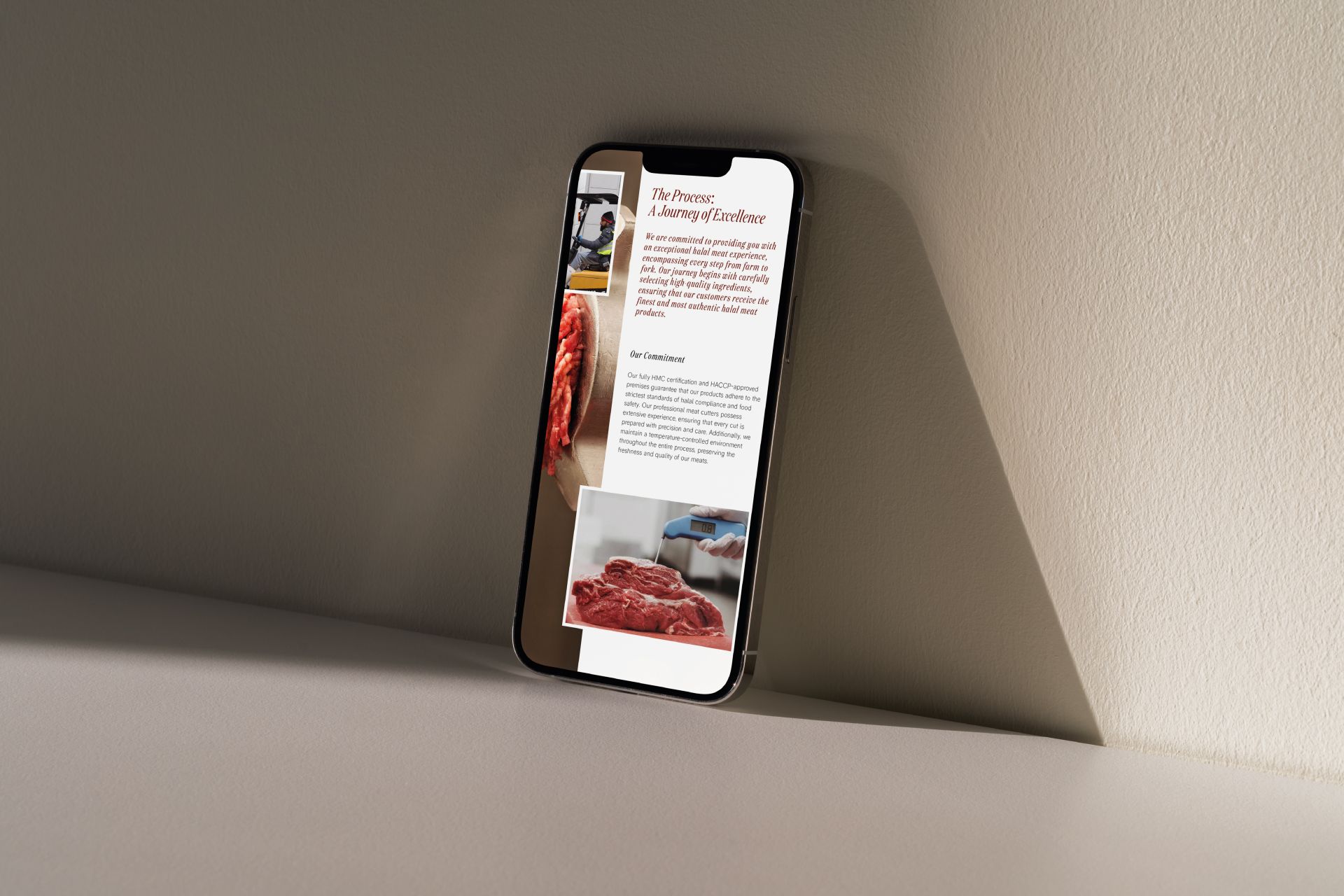
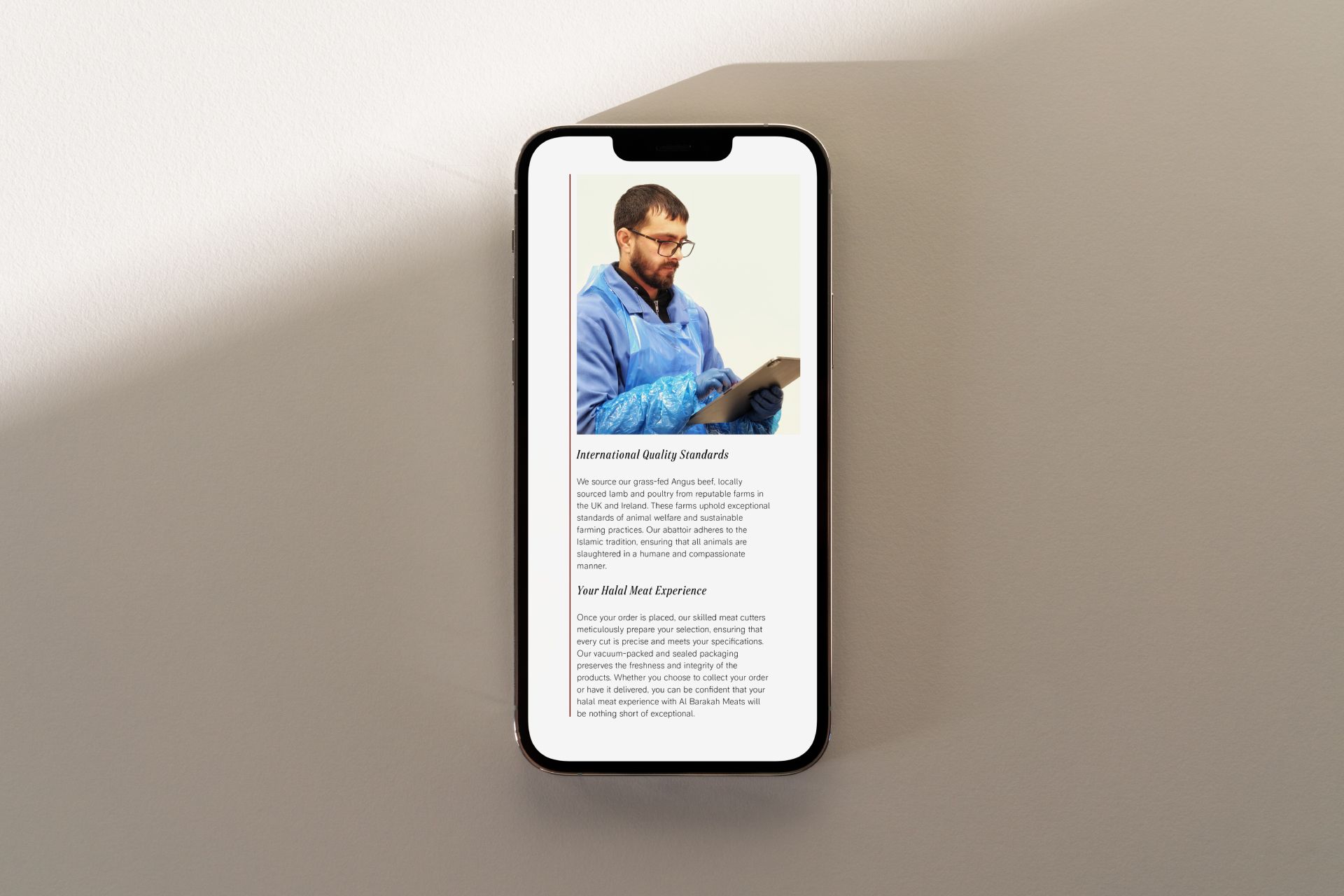
The website offers an intuitive, user-friendly interface, making it easier than ever for visitors to explore their collection of Misty Isle Gins and Misty Isle Vodka. Detailed product pages provide in-depth information about the unique distillation processes, the finest locally foraged botanicals, and the distinct flavors that set their spirits apart.

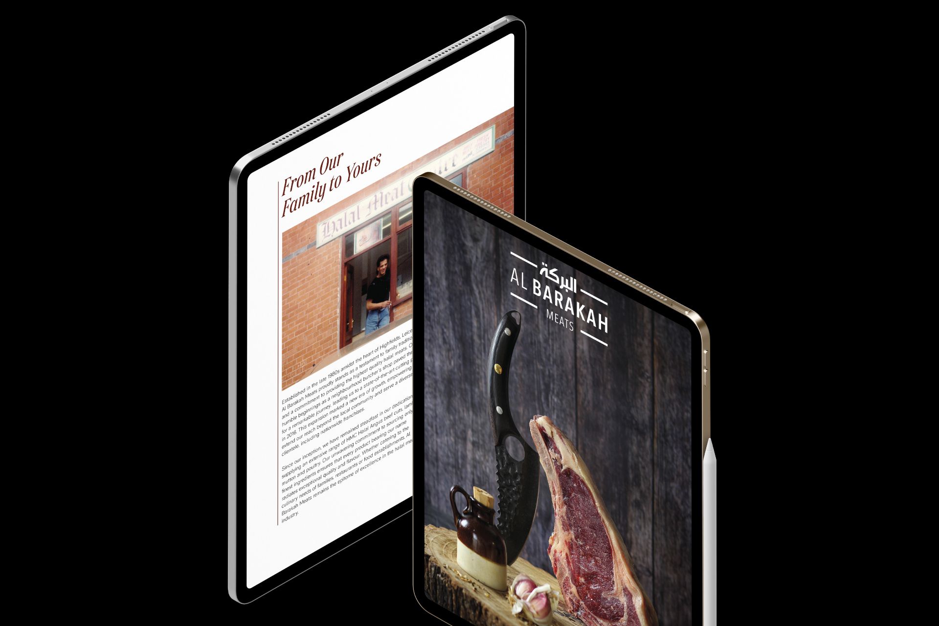
Built with WordPress, the website is fully responsive, ensuring seamless browsing across all devices—from desktop to mobile. Enhanced navigation and updated content allow users to dive deeper into the brand’s story, from their roots on the Isle of Skye to their innovative approach to spirit making. The site also features a dedicated blog section, where visitors can stay up-to-date with the latest news, cocktail recipes, and behind-the-scenes insights from the distillery.

In addition to showcasing their premium spirits, the new website includes a streamlined online shop, making it effortless for customers to purchase their favorite Misty Isle products directly. Secure payment options and optimized checkout processes ensure a smooth and convenient shopping experience.

As part of their expansion plans, the new site will also provide updates on exciting upcoming releases, including their much-anticipated Spiced Rum and future whisky production. This new digital platform marks a significant step forward for their brand, reflecting their passion for delivering a true taste of Scotland to customers around the world.

Print / Website

We were tasked to re-design Al Barakah Meats website giving it a fresh new look which would also compliment their range of lifestyle photography as well as designing a magazine catalogue for the family-run butcher’s that kicked off in the late ’80s in Highfields, Leicester.

Originating as a local purveyor of high-quality halal meats, the brand underwent a transformative shift in 2016, relocating to a cutting plant to facilitate business expansion and a dedicated focus on elevating the realms of retail and catering.

Since this pivotal move, Al Barakah Meats has consistently supplied a diverse array of HMC Halal Angus beef cuts, lamb, mutton, and poultry to the delight of local families, establishments, and nationwide franchises. Having worked closely with the team at Al Barakah Meats we designed a premium magazine showcasing their huge selection of halal meats as well as giving their WordPress website a revamp introducing nice animations, a wide variety of new photography and better user journey.

Branding / Website

Meltt brings the authentic taste of Philly steak sandwiches to the UK, promising a mouthwatering experience like no other.

At Meltt, they pride themselves on using only the finest ingredients, sourced locally whenever possible, to ensure every bite is packed with flavour and satisfaction.
Whether you’re a seasoned Philly steak enthusiast or a newcomer eager to discover the magic of this American classic, Meltt invites you to indulge in a taste sensation that’s sure to leave you craving more.

Crafted with a script-style font, the logo harks back to the golden era of vintage charm and timeless elegance. The logo’s swirling letters and timeless flair take you away to a bygone era, where simplicity mingled with sophistication, and each detail was meticulously crafted with care.

Branding / 3D Visualisation / Packaging / Website

We helped create a new brand identity, packaging, website and 3D visualisation for Necropolis Spirits, who are proud producers of small batch, hand crafted rum, which is expertly distilled in Scotland.

Deid Merchant is their first release, inspired by the rich history of the city. The rum’s full bodied fragrant base is a mix of Jamaican, Dominican and Grenada rums. Aberdeenshire brambleberries and Royal Deeside honey are added to the distillate to create a unique flavour profile, lime leaf and ginger bring warm spice notes with a hint of citrus.

The Necropolis, the brand’s namesake, is Glasgow’s Victorian City of the Dead, a vast and grand cemetery full of ornate graves, and sculptures, that sits on a hill adjacent to the Glasgow Cathedral.

The 37 acre Necropolis is the final resting place for over 50,000 souls; amongst them are the merchants, architects and cultural leaders who helped shape the city we know today. Their process follows traditional distilling methods, something Scotland is renowned for, and uses the finest ingredients available to us. The pride for the City and passion for their product is at the heart of every bottle.

We based their new company brand on the famous Necropolis burial site using the shapes of the gravestones within the logo. As well as the branding we helped develop their e-commerce website, and to help with the visuals of their product we created a range of 3D renders to compliment the rum in an eye-catching way.

Animation / Website

We created a new website that is both innovative and playful. The design is high-quality, yet it also has a sense of fun and whimsy. The website is sure to engage users and leave them with a positive impression.

At STACK SHACK, quality is the foundation of everything they do. They use only the finest prime quality beef, ultra-fresh potatoes, and buns to create their burgers. Each order is served with crispy fries, completing the ultimate gourmet burger experience.
STACK SHACK has made its mark in Birmingham and is making history in the world of burgers. Their goal is to bring the ultimate burger sensation to everyone, everywhere. With each bite, you’ll discover why STACK SHACK is dripping with flavour.

In addition to their burgers, they also offer sides like crispy French fries, onion rings, waffle fries and potato tots, as well as milkshakes and soft drinks to wash it all down. Whether you’re grabbing a quick lunch or enjoying a casual dinner with friends, their burger concept is the perfect spot for burger lovers of all kinds.

We collaborated with the restaurants in-house designer in putting together a brand new WordPress website built using the popular builder Elementor Pro. We created an interactive website that uses sleek animations and best practice code to engage users and guide them through the conversion process. The website loads quickly and is easy to use, making it a pleasure for users to interact with.

Branding / Packaging / Website

We were approached by Coffee Conscience to give their brand identity a refresh that reflected their philosophy and passion about their coffee as well as the environment; every cup makes a difference by delivering social, environmental and community responsibility.

Their philosophy and beliefs are; every cup makes a difference by delivering social, environmental and community responsibility.
The dedicated and experienced team have worked with Fairtrade products within the hot beverage market since 1998. As one of the first teams to supply Fairtrade Coffee to sector businesses such as Universities, Local Authorities, Colleges, Retail High Street Cafes, etc. today they continue to provide the support and help bringing communities together.

We collaborated with Chinese illustrator Nix Ren who helped create the beautiful illustration that will represent the new identity for Coffee Conscience and see this rolled out across all new marketing materials.

Branding / Packaging / Website

We’re flipping the script on burger branding for BEEFY’Z! We worked closely with the restaurant to create a look and feel that’s both bold and rebellious. The new branding includes a logo that’s sure to turn heads, a website that’s packed with attitude, and marketing materials that will make you want to eat burgers all day long.

BEEFY’Z is a new burger restaurant in Birmingham that is sure to become the new go-to spot for a delicious and satisfying meal. Offering a wide variety of halal burgers, all made with fresh, high-quality ingredients.

In today’s competitive restaurant industry, it’s more important than ever to have a strong brand. A well-designed brand can help you stand out from the competition, attract new customers, and build loyalty with existing ones.

The logo is a simple, yet bold design that features a stylized burger patty as the main icon. Although the branding is mono we added the pink to give the identity a vibrant and edgy fee. We wanted to show some kind of identity involving a burger icon so we decided to incorporate the apostrophe into a burger given the name “BEEFY’Z”. This also gives the brand a quirky side to it with messaging and turning the icon into quotation marks.

Branding / 3D Visualisation / Packaging / Website

Creating a new brand identity, bottle and multiple label designs as well as a range of 3D visuals to be used across social media. A critical and highly skilled part of the whisky making process that requires a lot of experience to ensure a consistent flavour profile for peated and unpeated whisky.

Not simply drying out the barley after germination but stopping the grain using the starch which is essential during distilling.

Moisture content, temperature control and the need to render enzymes inactive before milling. The Kilnsmans’ Dram celebrates the dedication, experience and ability to read the requirements of a malting floor and the interaction between the grain and the heat. Goldfinch Whisky released this range to shine a light on this skill set which is dying out in distilleries but is being modernised through modern craft maltsters using mechanised systems.

When you see the thumb print on the bottle, you know the Kilnsman’s would have approved of the spirit quality included in the bottle. The tapered body and pronounced shoulders blend with barrel neck to emphasise the premium nature of the Spirit within. These elements and the brand positioning were documented in a set of guidelines, to ensure the consistent application of the brand at all times.

Branding / Website

From a young age, Tiberius Tudor felt the allure of fire – its raw power, the hypnotic dance of the flames and the endless potential for culinary alchemy. This fascination ignited a lifelong pursuit of mastery. Years of dedication transformed that spark into a deep understanding. Today, he wields fire not just as a tool, but as a collaborator, crafting some of the most celebrated BBQ creations.

Tiberius Tudor’s philosophy centres around achieving the perfect symphony of flavours.
By meticulously balancing seasonings, heat and time, he elevates exceptional quality meats with the very essence of life itself – the smoky whispers of the earth. The reward? Witnessing the awe and delight on each guest’s face as they experience the results. It’s a testament to the power of fire and the magic he creates.

Fire has been humanity’s oldest companion, and Tiberius is driven by the insatiable desire to unlock its full potential, one delicious dish at a time.

We created a visual brand identity that would show the raw edge of Tiberius Tudor as well as a responsive single page website which gives a brief introduction into his life.

Branding / Packaging / 3D Visualisation

Branding and packaging for a new Perth based Gin.

a’Gin is distilled using botanicals hand picked from the banks of the River Tay. Sweet Cicely, Lemon Balm, Sorrel and Nettles are blended to flavour their gin that is unique and exclusive to the North Port Restaurant.

We designed their new branding and packaging, collaborating with a local artists who had screen printed the botanicals and applied to the artwork.

Branding / Packaging / Website

Creating a new brand identity, packaging and online store for this Leicester based beef tallow product. The tallow is slow rendered specifically for cooking and is a great alternative to seed oils.

At Bronze Calf, they believe in bringing you a quality product that’s as versatile as it is sustainable.

Tallow is a cooking fat and can be used as a substitute to any other oil or fat you would usually cook with. It’s commonly used for a range of cooking applications such as frying, roasting and sautéing. We created their logo using old fashioned blocked letters to make this new brand stand out in the beef tallow market. The brief was to make the identity minimal which would reflect their label designs as well as build an online store using WooCommerce.

Branding / 3D Visualisation / Website

Develop their brand identity, print collateral, 3D visuals and a range of digital assets.

Brave New Spirits is a brand creation and bottling business, specialising in single malt Scotch whisky and fine spirits.

They also distribute a growing range of products created by a selection of the finest international independent whisky bottlers with offices in Scotland, England and Germany.

Branding / 3D Visualisation / Packaging / Website

A new bottle design for Paloma, a Palo Cortado range released by Goldfinch Whisky Merchants.

We created Paloma to show the expansive influence different types of sherries can have on a variety of single malt whiskies. By focusing on the Spanish connection in terms of art, sherry and the name; Paloma means ‘Dove’ in Spanish , we have created something that is beautiful, timeless and tastes incredible.

Palo Cortado is the rarest type of sherry with less than 100,000 bottles sold a year, compared to 60 million bottles of sherry overall.
Whisky is about a moment. It’s about listening and sharing. That is why Goldfinch Whisky chose the best quality Bodega casks that previously contained one of the rarest sherry varieties in the world to finish their first cask release.

It is a wonderfully complex wine which combines the delicate bouquet of an Amontillado with the body and palate of an Oloroso. It is deep and warm mahogany in colour with a complex nose that truly harmonises the characteristic notes of Amontillado and Oloroso. You will find citric notes reminiscent of bitter orange and lactic notes suggestive of fresh butter. It has a deep, rounded, ample palate with smooth, delicate aromatic notes appearing in the aftertaste, leading to delicious lingering finish.

The stunning artwork featured in the label was painted by Catalan painter Isidre Nonell in 1904. The painting is titled – La Paloma and the original is currently exhibited at the National Art Museum of Catalonia in Barcelona.

Art Direction / Branding / Packaging / 3D Visualisation

Creating a new brand identity, bottle and multiple label designs for the latest Goldfinch Series as well as a range of 3D visuals to be used across social media.

A selection of 5 sherry hogsheads containing Blair Athol single malt scotch whisky which was then sourced and imported to 5 different wine casks from Europe and reracked the single casks into the wine barrels to create the “Wine Series”.

Their objective was to create a range that allowed a whisky connoisseur to explore the effects of finishing on the same single malt. The team at Goldfinch Whisky Merchants selected a Marsala Oak Pipe, a Tawny Port Pipe, two red wine barriques from different first growth Chateaux and a sweet white wine from Germany.

Art Direction / Branding / Packaging / Website

New website for global coffee chain Gloria Jeans UK. Gloria Jean Kvetko was a determined young mum from Chicago with a dream to own a coffee shop where she could combine her passion for caffeine and meeting people.

Fast forward to 1991 and Gloria Jeans one coffee shop dream had expanded to 50 store locations and had quickly become one of North America’s largest and most loved coffee chains.

The UK’s adventure with Gloria Jean’s Coffees started with the opening of its first store in 2019 in London.

Work Coming Soon (2025)

A look at some projects set for 2025 that are still being worked on. It’s a quick preview of what’s in the pipeline, giving you a sense of what’s coming up.

Branding / Packaging / Website / Social Media

Branding

Branding

Packaging / Design

Branding / Packaging

Branding / Packaging / Design